Datasets and Charting
Geographic Chart
For my geographic chart, I was going to do a choropleth map. After considering different topics, I was inspired by the rain outside to do rainfall amounts. I found a page from WorldPopulationReview called the Wettest States in 2024. I copied their Mean Annual Precipitation data into a Google spreadsheet.
In Datawrapper, I connected my sheet data and created the choropleth map. I chose a blue-themed color palette to represent the rain. I also kept it as a continuous scale to show the fluctuating range rather than set amounts.
I made sure the legend had a caption describing the data units, inches. I tried adding the unit to the tooltips but decided that it wasn’t needed.
Overall, this was a straightforward chart to create, and I ended up with a clear choropleth map.
Reliable Source Chart
For my reliable source graph, I was interested to see levels of flu illness each year, so I went to the CDC’s website with their article about Past Seasons Estimated Influenza Disease Burden. I had heard that the safety precautions for COVID-19 also lowered flu cases and saw that the data showed that.
The CDC calculates “disease burden” using multiple factors like medical visits, hospitalizations, and deaths. I copied all of this data into my spreadsheet.
The website noted under the table that “** Estimates are not available for the 2020-2021 flu season due to minimal influenza activity.”
After playing around with the graph types, I chose to narrow it down to just symptomatic illness estimates.
Custom Chart
The third chart, one with custom data, involved the most work.
First, I tried to think of topics that could have interesting intersections of different data. After a while, Google Trends came to mind as a possible resource for search interest over time.
The initial idea I started going forward with involved search terms for disinfecting products like Purell hand sanitizer, Lysol, and Clorox bleach. These all had a major spike during 2020 because of the COVID-19 pandemic. I wanted to find another resource to add to this and discovered a Statista graph of hand sanitizer revenue per year. However, I struggled to find revenue data for the other products, so I decided to focus my chart on hand sanitizer only.
Dealing with Data
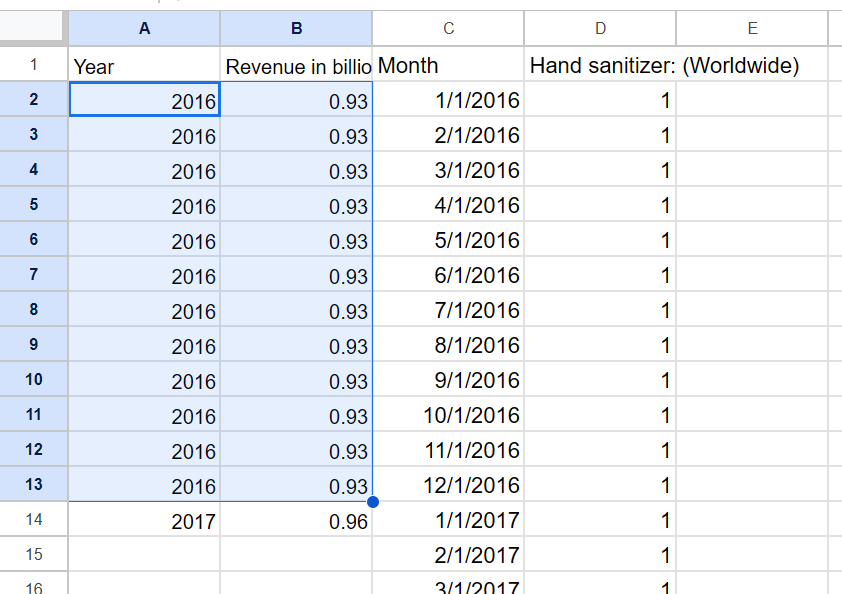
I input the revenue data by hand then tried to figure out the best way to incorporate the search interest numbers. At first, I downloaded a spreadsheet with search results from the past five years and copied over the numbers. However, I noticed two things - one, the data went by weeks and many cells had hashtags in place of dates that I had to delete; two, the revenue data went back to 2016 which is more than five years ago. I returned to Google Trends and created a custom time range that did extend to 2016.
I adjusted the time range to get all the data I wanted
The revenue data was by year while the search results were by month. I decided to try filling the cells with multiple instances of the revenue.
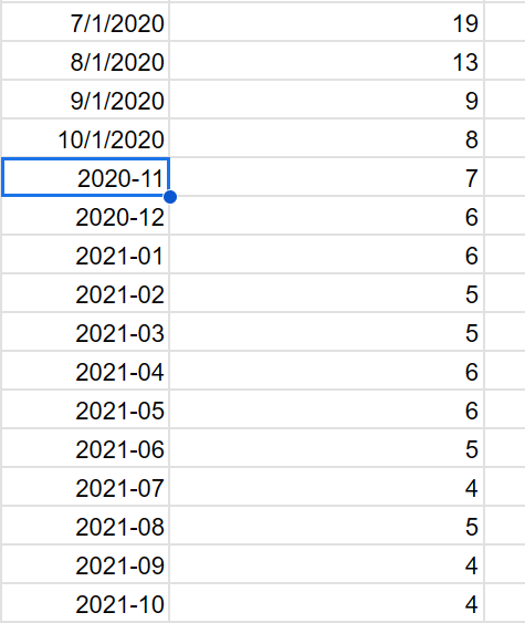
A problem with the search interest I noticed was that after Oct. 2020, the way the dates were written changed.
The search interest data changed date format partway through
I manually went down and changed them to match the above ones.
Graph Attempts
I explored different chart formats to see how they changed. This is a regular line graph that was a understandable choice for my chart; however, as shown, the lines looked strange and hard to read. I knew the datasets would have different axis values and this validated my concern.
I tried searching how to add two separate Y-axes in Datawrapper but found out it is not possible. Instead, I switched the chart to a multi-line one which split the two sets.
Now they are separated but still don’t look right.
This changed when I discovered a switch under Refine that let me give each chart its own axes.
With this selected, there was progress towards the graphs looking complete.
While revenue looked better and was easier to read, search interest was still squished and hard to hover over. I went back to my spreadsheet to experiment.
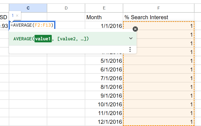
Instead of having so many points of search data, I thought I could instead average them to get a singular number per year.
Averaging the month percentages to get one per year
What happened, though, is while the original search data showed 100% interest during 2020, the averages made the graph show the max interest as only 20.83. I wanted the chart to show the full scale.
I took a step back and removed the averages. Then I split the revenue dates from full years into months to match the search data. I kept the dollar amount the same between each month in the year. I was left with three columns that were more simple and cohesive.
Breaking the years into months
Now the two graphs were much clearer; the left moved up in steps for each year’s revenue while the right smoothly showed the search changes each month.
There were some slight adjustments I made here. First, the dates in the spreadsheet were just the month and the year but while hovering on the graph, it would say the first day, e.g. Mar 1, 2020 instead of Mar 2020. I wanted them to encapsulate the entire month, so under the Tooltips section, I changed the Dates Format to Month, Year.
Second, the right graph automatically made the Y-axis go from 0-120. However, since it is percentage, 100 should be at the top. All I had to do was lower the Panel Height by a pixel and both sides adjusted accordingly.
I filled in the title and sources to create my final, interactive graph.


