UX Research Analysis: Hagaman Library

The website for Hagaman Memorial Library in East Haven, Connecticut was evaluated, studied, and put under user testing to determine what changes could be made to improve the experience of its users.
The Website
Hagaman Memorial Library’s website can be found at hagamanlibrary.org.
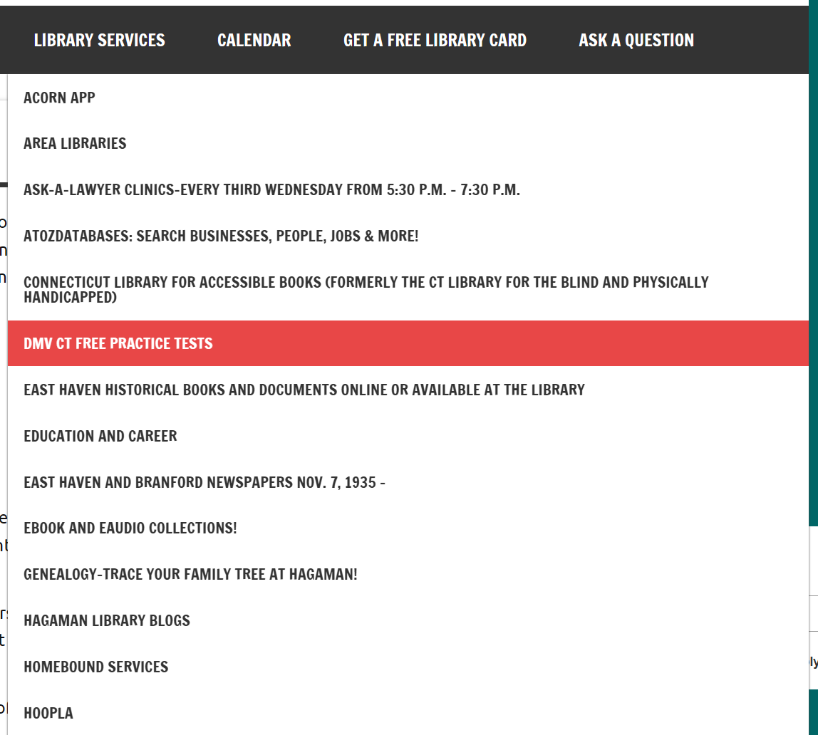
The first thing visitors may notice is the abundance of text-filled boxes on the homepage. The navigation bar consists of various categories: About Us, Kids, Teens & Young Adult, Adults, Catalog, Library Services, Calendar, Get a Free Library Card, and Ask a Question. If the visitor should hover over the Library Services option, a long list of links will drop down in alphabetical order.
Methods Used
One of the first evaluation methods conducted was a comparative analysis. In this, three other Connecticut libraries were chosen and their websites were compared to Hagaman’s. These libraries were the New Haven Free Public Library, James Blackstone Memorial Library, and Willoughby Wallace Memorial Library.

Unique Features
Unique resources
Chat box for questions & discussion
Design Strengths
Simple colors
Consistent structure
Design Weaknesses
Wall of text boxes
Long menu dropdown
Long sidebar
No search bar for site, only catalog

Unique Features
Module of tutorials on left side
Translate module on right side
Design Strengths
Drop down menus
Visual icons
Strong color scheme
Book highlights
Multiple calendar views
Design Weaknesses
Book carousels don’t stay still when hovering

Unique Features
Unique resources
Tabs in eResources & collections modules
Design Strengths
Drop down menus
Upcoming events module
“What are you looking for?” section near top
Translate dropdown
Design Weaknesses
Searching fills whole screen

Unique Features
Art gallery/exhibitions section
Design Strengths
Clean organization
Good use of images
Photo carousels in resources & homepage
Design Weaknesses
Months old events left up, making page long
Event pics too large to view fully
Two menu bars

From this initial view of Hagaman’s website, some ideas for improvement emerged.
Menu
“Library Services” tab is a long, alphabetical list; submenus and reorganization could make it easier to navigate
Boxes
Main page is a wall of boxes filled with text; this can be streamlined to be less crowded and more clear
Body Content
Many pages consist of a large amount of text that can be cleaned up and reduced; other material can be added to break up the words and improve UX
Better use of visuals like images and icons
Site Search Bar
Can only search catalog, not website
Typography
Better typeface choices, less caps for better hierarchy
Personas
3 personas were created to represent different potential users of the site with different ages and goals.


Interview
An interview study was created but not performed.
It begins with Warm-up questions asking where the interviewee lives and how often they visit the library. Then it goes into the body of the session.

After that, the interview goes into the Cooling-off phase where the interviewer asks if there is anything else the participant would like to add. Then it’s the wrap-up where materials are put away and the interviewer asks if the participant has any questions for them.
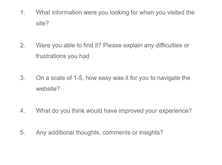
Survey
A survey was created using Google forms, though no responses were actually collected. The survey collects demographic data about the users as well as quantitative data about their opinions of the website. There are 21 questions in total, a mix of multiple choice, multiple response, Likert scales, and open ended.


Diary Study
Diary studies are a longitudinal UX research method used to track information over a period of time. Rather than being in a research facility or interview room, diary studies seek to gather information in context of where they take place. Participants self-report experiences in “diary entries” for a length of time.
For the proposed Hagaman diary study, participants are asked to record an email diary entry each time they visit the website over a two month period. The entries require filling out a few simple questions.
Card Sorting
A card sorting exercise was created and performed remotely with three actual participants. Cards were created from various links and pages on the current website. Participants were then asked to group ones they felt belonged together and give the group a name.
The first participant made 8 groups, the second made 6, and the third made 5.
To summarize:
All three participants grouped these items:
Contact Us / Education and Career
East Haven Historical Books and Documents / DMV CT Free Practice Tests
East Haven and Branford Newspapers Nov. 7, 1935- / World War II Veteran's Discussion Group 2014-2019
Archive / ResearchIT CT Databases
Meeting Rooms / Calendar
Notary Service / Online Resources
Two participants labeled a group “Library”
Two participants had similar names with “Specific Historical Topics” and “Historical / Documentation”
Heuristic Evaluation
Jakob Nielsen and Rolf Molich created 10 Usability Heuristics in 1994 that are still used as guidelines for user friendly design.
The heuristics are:
Visibility of System Status - How informed users are of what the product is doing
Match Between the System and the Real World - How easy the product is to naturally understand
User Control and Freedom - Ability for users to stop / cancel / undo any taken action
Consistency and Standards - Keeping already known and understood aspects consistent
Error Prevention - Preventing user errors before they happen
Recognition Rather than Recall - Reducing users’ need to remember things by having information visible
Flexibility and Efficiency of Use - Providing shortcuts or personalization for experienced users
Aesthetic and Minimalist Design - Reducing irrelevant or distracting content or design
Help Users Recognize, Diagnose, and Recover from Errors - Proving clear error messages and helpful suggestions
Help and Documentation - Proving easy to access help
The Hagaman website was evaluated with these heuristics and graded on how severe the issue with each guideline was.


Though some heuristics did not apply to Hagaman or were fine the way they were, some like the minimalist design were severe. This helped highlight what areas of the website may be problematic, something that would be supported with the next exercise.
Usability Testing
The usability test was also performed with real participants, this time a mixture of remote and in person users. The three participants were each given 6 tasks to do on the website. They were observed by the researcher and timed to see how quickly they were able to complete each one.
The tasks were as follows, ordered in increasing difficulty:
Task 1. Imagine you are a teen who has heard about the Hagaman Teen Advisory Group (HTAG) at the library. Figure out how you can join the group.
Task 2. You want to know what times the library is open on different days. You also want to see if they are closed or have different hours for events like holidays. Try to find this information.
Task 3. You’ve heard that Hagaman is having a movie night on March 17th! You’re not sure which movie it is, though, or what time it will be. Use the calendar to find the answers to these questions.
Task 4. You’ve heard your grandpa mention being in the local newspaper back in November of 1955. You decide to check out Hagaman’s online archive of old East Haven newspapers to see if you can find it.
Task 5. Imagine you are an artist who wants to display some of your work in the library. Find the page section that gives information about doing so.
Task 6. You’re curious about the different ways you may be able to help out your local library. You decide to look for the “Donate” page to see what methods it offers.

Task completion times for each participant; DNF = Did Not Finish
Final Recommendations
The evaluations and tests performed in this study provided a lot of valuable insight into how the current Hagaman serves its users and what pain points exist in its design. After examining the analyses, the researcher has come up with a list of potential suggestions that could be used in a redesign of the Hagaman Memorial Library website.
The recommendations are thus:
Allow the search bar to search the site, not just the catalog
Move the Donate button to the end of the nav bar for visibility
Rethink pages with unclear names like Hoopla; consider moving the content to other areas instead
Reduce the amount of text on pages; use more visuals like images and icons
Group similar items; make the schedules viewable in the same area such as with Calendar
Move hard to find pages to clear menu locations
Reduce links in menu dropdown; group them into subcategories or remove them altogether
Update or remove outdated / inaccurate information
Give newspaper archive filters for different years
Reorganize sidebar; remove link to chat service being used, and in general, put the most important or engaging features higher, eg. Search, Newest Books, Schedule, Mailing List
Create section for history based items
Text should be redesigned for better hierarchy with less bold and caps
Ensure consistency on every page
Final Document
Click the button below to see the full PDF presentation of this UX research analysis.