
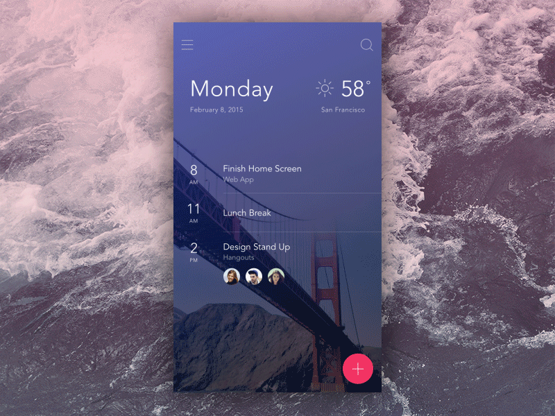
User Interface Motion
Reading & Writing
Chapter 10 of Liz Blazer’s Animated Storytelling is about finally animating your project. She provides tips to keep in mind throughout the process to make sure things stay on track.
This begins with preparatory things like creating a production calendar, making sure your technology is working, and saving often in an organized way. Then Blazer goes into starting the actual animation. She gives tips such as starting with the easier parts to get into the groove and build confidence with what you’re doing. For the harder parts, she suggests breaking them into pieces, little mini stories that are easier to handle. Blazer says you should evaluate which shots are absolutely necessary and which can be cut to save on spent time and effort.
Blazer goes on to encourage readers to consider the movements of not only their characters, but the “camera” the animation is viewed through. Look back at your storyboard and go more in depth with how everything should move scene-by-scene.
Finally, sound is the last touch needed to give life to your animation. Explore different music and sound effects, and make sure the animation moves with the sound. It is important that both aspects flow in harmony with each other, “a kind of dance, a back and forth between sound and image that is rhythmically paced and elegantly timed” (Blazer 187). At the same time, the animation shouldn’t be fully reliant on the sound for its story. It should still be able to express emotions and meanings without any sound at all; the sound is just the icing on the cake.
Research to Inform
This first example of UI animation is by Dribbble user Anton Aheichanka. It shows a round button with a plus sign that rotates into a closing x as it opens a menu. It compacts the elements into a smaller area that can be opened when needed, leaving more free space on the screen.
This next one shows a similar idea, except with a hamburger menu morphing into the x. It is a very smooth transition that clearly shows the different states of the menu.

Source: Hike One
This next animation uses its product as inspiration for its design. Since it is a food ordering app, it uses order tickets for the items and lets the user scroll through each one. The tickets sway with a movement that gives them realism and believability.

Source: Fix the Photo
Create
For my UI animation, I decided to do an “add to cart” style icon that animates when you click it. I imagined objects being tossed into the cart and it tipping at the impact.
I looked up shopping cart clipart for reference. Then I used the line and shape tools in Illustrator to create my own. I had the idea of the cart changing color when hit so I made two copies, one a light grey and the other purple. I also made a test box with a rounded rectangle.

I realized I didn’t know how I would make the cart change color from a specific point with two of them. So instead, I made a big purple circle that would be masked by the cart. After moving to After Effects, I realized masking made the cart invisible so I did need to go back and add a second one anyway.
In After Effects, I started by moving my box. I changed the Keyframe interpolation to bezier so I could make it fall with a natural curve. I also added Easy Ease.
When the box touches the cart, it tips back slightly. Also, the purple circle scales up to fill the masked cart. I had to make both the grey and masked carts have the same rotation so you wouldn’t see one during the movement.
I also learned how to use an aspect of After Effects that I had never touched before: Null Objects! I wanted to move an anchor point without messing up previous animations that had it in a different spot; specifically, I needed the anchor on the back wheel for the shopping cart to tip back, but I needed it on the front wheel to tip forward later on.
After Googling, I saw people saying they usually used a “null object,” an invisible item that you can make a layer’s parent to separately affect their traits. I created one, moved it into position, and lassoed the cart layers to it. I adjusted the rotation then tested it - and it worked! I was very excited by this cool new technique and decided I should do the same for the box as well.
The box hits the cart, then tips forward before falling back. I had the idea, but thought I had to make do with slightly rotating the whole thing. With a null object, I could move the anchor point and make it look a lot more natural.
After adjusting timing and rotation, I am very happy with how it turned out. Here is the animation after I used Photoshop to make it a GIF. It shows the “add to” and “remove from” cart in an endless loop.

And here is the video of it.